Case study · Travel marketplace
Hilton Grand Vacations
Redesigning Hilton’s booking platform to streamline reservations, unify legacy systems, and make vacation planning easier for owners.
Personal note
I spent two years as principal product designer on Hilton Grand Vacations’ booking platform. The short version: years of acquisitions and legacy tools had left owners with a fragmented experience—nothing like the Hilton.com bar they expected. My job was to help the team ship one coherent system, on the web and on mobile, without losing the complexity that timeshare ownership actually requires.
01
Understanding the current system
Where we started
Before we drew a single component, we mapped what was live: dozens of ownership flavors, an aging CMS, and almost no mobile coverage. The UI didn’t fail loudly—it quietly asked people to memorize rules the product team itself struggled to document.
What kept surfacing in audits — Inventory logic changed by account type. Points rules were buried. Marketing and product couldn’t move at the same pace because templates weren’t reusable.
02
Where owners struggled
What we kept hearing
In interviews, people weren’t complaining about “pixels.” They were tired of guessing whether their points would cover a stay, or why a path looked different from last time. Support could explain the rules; the interface rarely did.
Patterns we designed against — Flows that shifted mid-reservation. Balances and conversions you had to hunt for. Dense layouts that made scanning availability feel like work.
03
Designing a clearer experience
How we built toward it
This wasn’t a reskin. We needed a system that could stretch across 40+ ownership models and still feel like Hilton—familiar if you’d booked a hotel, honest about timeshare-specific rules, and legible on small screens for the first time.
What I owned — A 0→1 design system adopted across 8+ web and mobile surfaces, with accessibility and responsive behavior baked in—not patched on at the end.
A system owners could recognize
We anchored on Hilton.com patterns where they helped, then extended tokens and components for ownership-specific tasks (points, exchanges, resort inventory). Here’s the broadsheet view of that foundation—followed by a walkthrough of how components behaved across breakpoints.
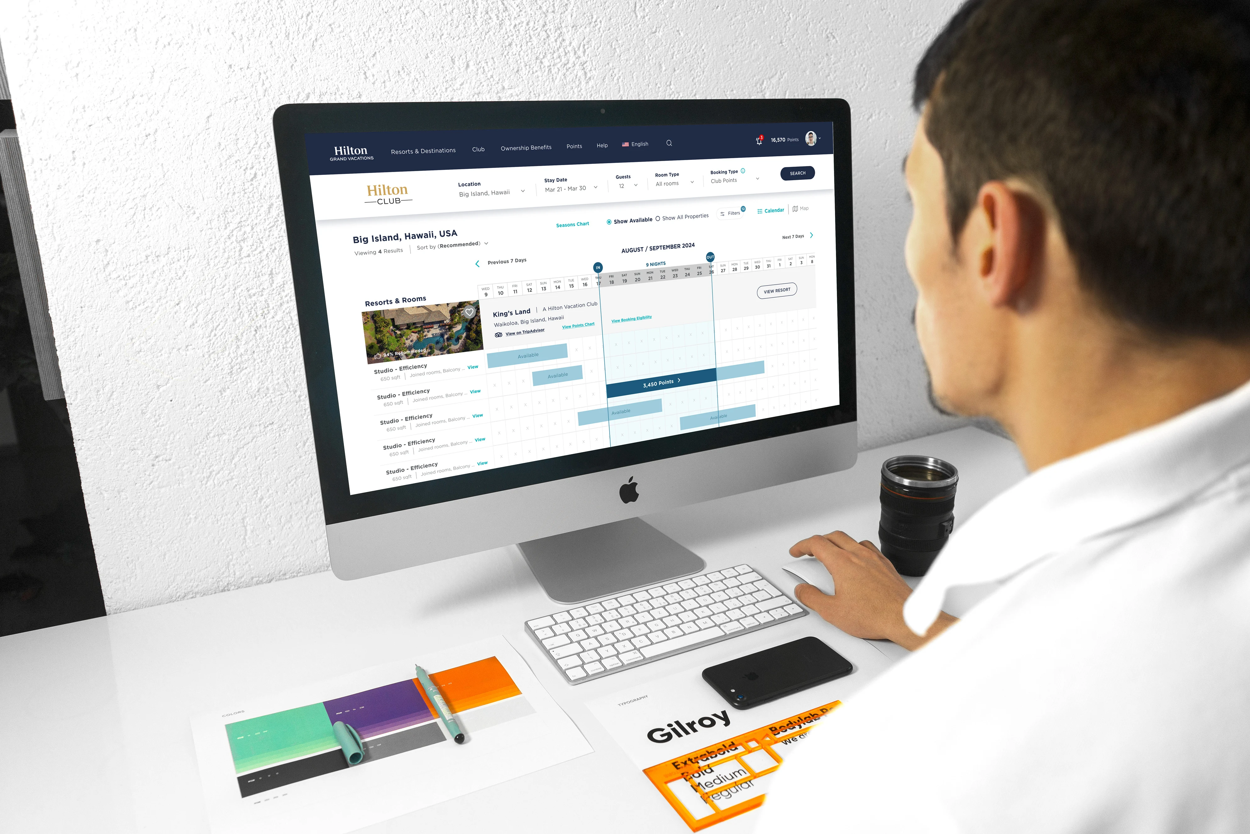
Exploring the core flows
Once the system had a spine, we pressure-tested it against the messiest reservation paths. These frames are from that exploration phase—how owners move from search to confirmation without losing context.
Booking, end to end
Static frames only get you so far. This prototype is the reservation journey in motion—the handoff we used to align product, engineering, and resort ops.
What it looked like on desk and phone
Finally, we put the system back into real devices—large screens for planning, laptops for hybrid work, phones for “I’m at the resort and something changed.” Same components; different postures.
04
Results & impact
What changed for owners
I’m proud of the shift from a patchwork of experiences to one permission-aware system that engineering could extend and marketing could actually land. The details below are the outcomes we optimized for—not a scorecard, but the story we kept aligned to in reviews. Native mobile screen recordings aren’t in this write-up; booking and product structure are illustrated in the sections above.
Booking completion — Fewer dead ends and clearer next steps across ownership types.
Support load — Points, ownership actions, and resort details surfaced where people look first.
Accessibility & reach — WCAG-aligned patterns so the experience wasn’t excluding the audience we needed to serve on mobile.